![]() It's not so long ago that Google decided to change the logo used for several years. Although this is not a major or significant change, the observant people of Reddit did not miss this fact and revealed it. And what is it really about? The familiar logo has remained mostly the same, but the letter "g" at the end of the word has moved one full pixel to the right, and the letter "l" has similarly moved, which is now located a little lower. At first glance, this is not a significant change, in any case, the created animation pointing out the difference between the old and the new logo surprisingly accentuates this change.
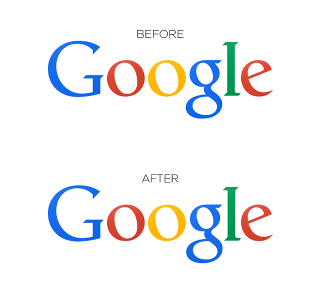
It's not so long ago that Google decided to change the logo used for several years. Although this is not a major or significant change, the observant people of Reddit did not miss this fact and revealed it. And what is it really about? The familiar logo has remained mostly the same, but the letter "g" at the end of the word has moved one full pixel to the right, and the letter "l" has similarly moved, which is now located a little lower. At first glance, this is not a significant change, in any case, the created animation pointing out the difference between the old and the new logo surprisingly accentuates this change.
We won't speculate on how long it took Google to create such a perfect logo, but from the graphic side, the company has done it very well, the letters now fit together much better, the spaces between them are more regular and above all, all the letters are in a plane. The question is, however, whether the classic visitor to the most used search engine in the world will even recognize it.
*Source: Reddit
