
![]() Until the release of a new version of the operating system Android, labeled as Android L is only a few weeks away, and Google is apparently still putting the finishing touches on its Material Design. According to recently leaked photos, the company has redesigned the Google Play Store to fit more into the system's new look. And that Google is dead serious about the new design is also proven by the fact that the Play store has already been radically updated in this context, as well as the Hangouts application and the Chrome browser.
Until the release of a new version of the operating system Android, labeled as Android L is only a few weeks away, and Google is apparently still putting the finishing touches on its Material Design. According to recently leaked photos, the company has redesigned the Google Play Store to fit more into the system's new look. And that Google is dead serious about the new design is also proven by the fact that the Play store has already been radically updated in this context, as well as the Hangouts application and the Chrome browser.
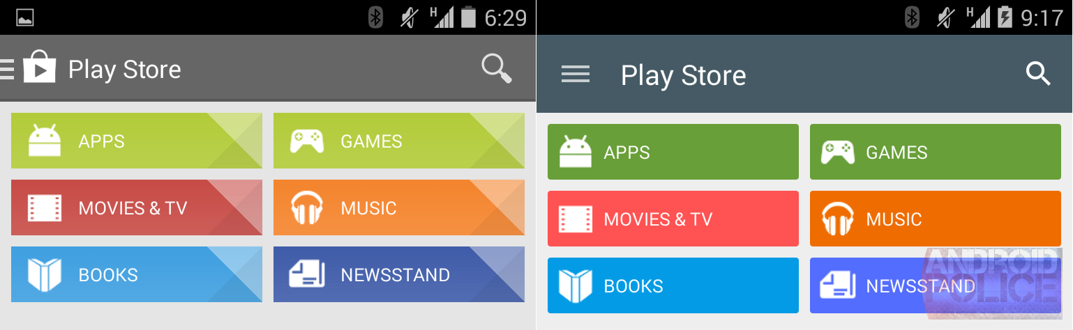
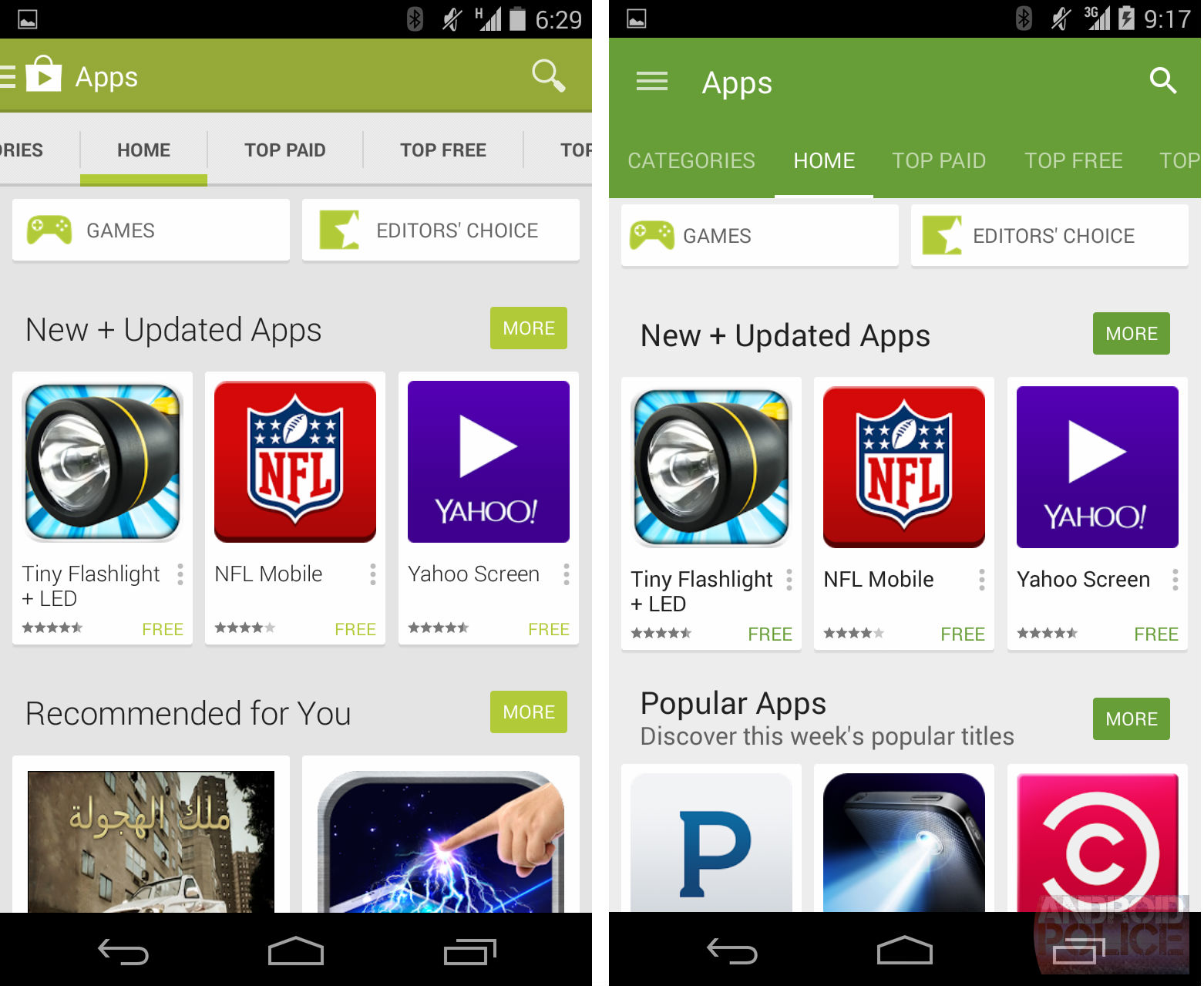
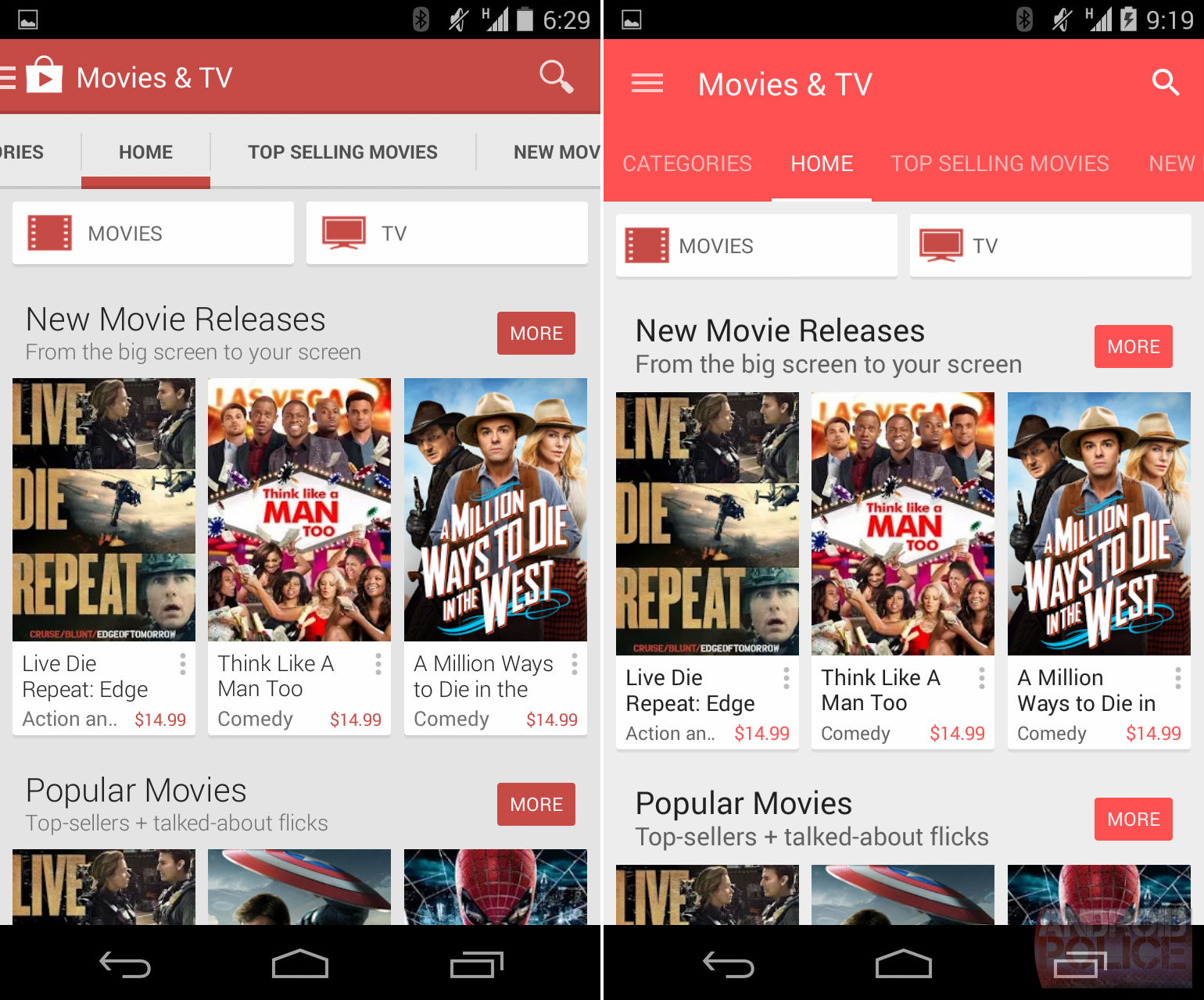
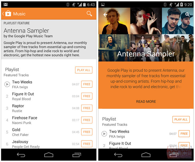
This time, however, the news is almost not about new features or moving buttons, it is more or less only a matter of colors, which, as you can see in the images below the text, have been considerably darkened compared to the original version, that is, with the exception of the Movies and Newsstand categories (Newspaper) where the red and blue colors used were lightened for a change. The color scheme was modified in the top menu, where the selection of categories blends in color with the title, from which the Google Play logo has disappeared. However, the design of playlists from the Music category has been completely redesigned, it now looks much more modern and clear. It is not yet clear when exactly the Google Play update will be available to the public, but it should happen soon.
// < 

// < 


