![]() Everyone knows Samsung today. Everyone knows it's the company with the dark blue oval logo with the huge "SAMSUNG" written on it. But do you know that this is already several company logos in a row? A South Korean giant with a truly gigantic name (as you could read in a separate article), has changed its logo several times since its creation in 1938. Now it seems that the company will change its logo again and that's why we decided to show this history of the Samsung logo.
Everyone knows Samsung today. Everyone knows it's the company with the dark blue oval logo with the huge "SAMSUNG" written on it. But do you know that this is already several company logos in a row? A South Korean giant with a truly gigantic name (as you could read in a separate article), has changed its logo several times since its creation in 1938. Now it seems that the company will change its logo again and that's why we decided to show this history of the Samsung logo.
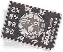
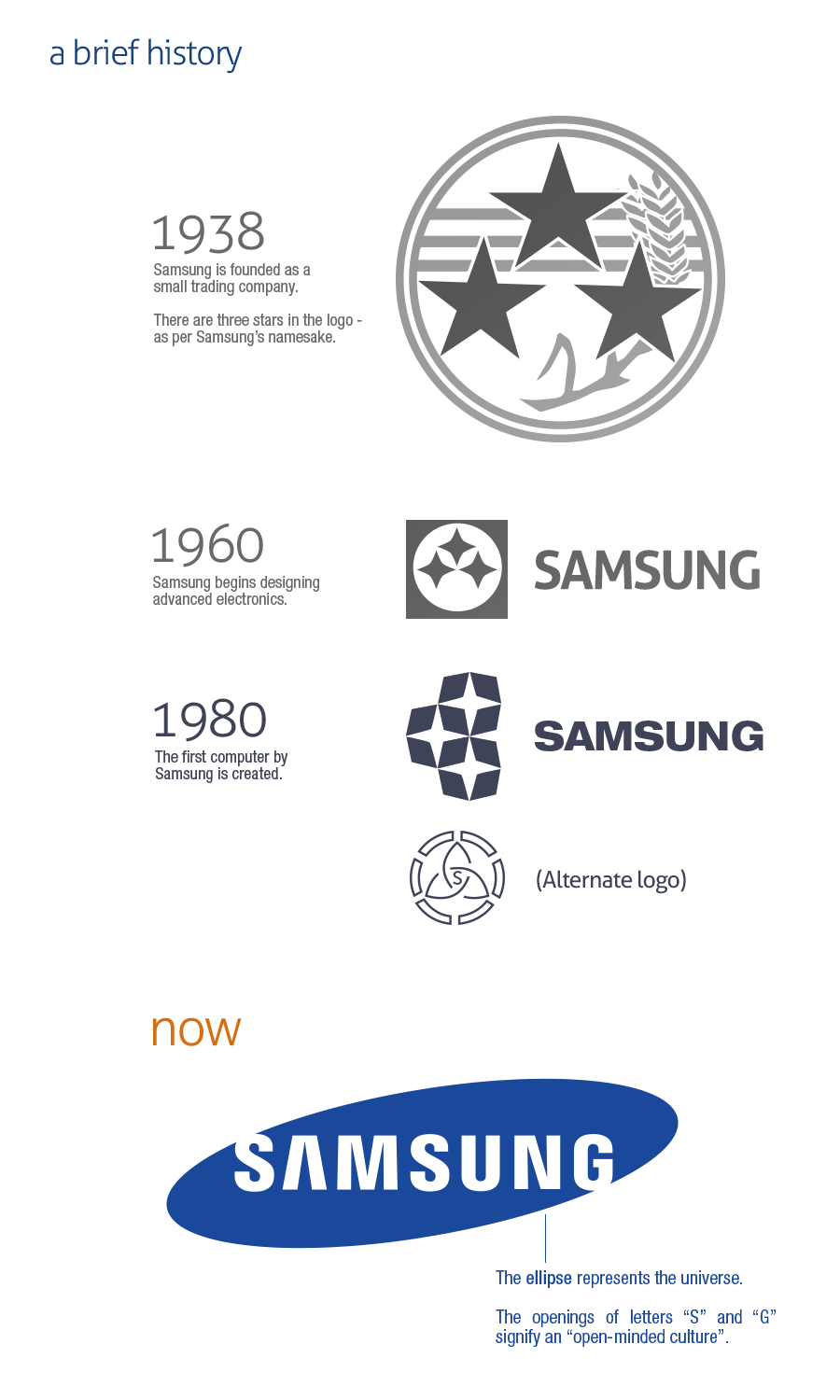
Already in 1938, it came up with a logo that was quite common for those years. It was not simple, rather it seemed complicated and very progressive. Since it was a company selling food, the logo was in the spirit of a postage stamp or a quality crop. Well, anyway, the logo was completely different from the other logos. Well, we can already see three stars that appeared in other logos and are closely connected with the name "Samsung".

Later, the logo was simplified, internationalized, and initially the food company had to translate its logo into English, because it began to gain influence overseas. Since 1960, we have therefore seen the logo of three stars in a circle and next to it the easily legible name of the company. This logo remained in circulation for 20 years, after which it was replaced by an even simpler logo. You could also come across this logo on some products that were sold in our territory in the early 90s. An alternative logo was also used alongside it, but it is not as well known as the traditional logos. In 1980, he produced his first computer. However, he started with electronics already in the 60s, which was the reason for changing the logo and removing cereals from it.
Finally, from 1992, the company started using the traditional "space" logo, which it uses practically until now. This logo is characterized by a blue oval that symbolizes the universe, thus also the magnificence of the company. Well, you may have noticed that the S and G stick out, which is intentional. It presents an open company culture. And now it looks like the company will use the simplest logo possible - just plain text in blue or white.
var sklikData = { elm: "sklikReklama_47926", zoneId: 47926, w: 600, h: 190 };


var sklikData = { elm: "sklikReklama_47925", zoneId: 47925, w: 600, h: 190 };
*Infographic: Eric Tong