The Google Chrome browser has been around since 2008, when its first beta version was released for the system Windows. Back then, however, his icon looked completely different than it does today. Chrome's iconic sphere has retained the same basic design elements and colors, but its appearance has been gradually minimized over the years.
First it was in 201, the next redesign came in 2014. Now Chrome is continuing this trend, although it has taken its time, as it is doing so for the first time in eight years. While the changes may then look somewhat understated, the main point is to make the icon more flexible and adaptable across platforms and their design languages. Chrome designer Elvin Hu detailed what's changing.
Some of you might have noticed a new icon in Chrome's Canary update today. Yes! we're refreshing Chrome's brand icons for the first time in 8 years. The new icons will start to appear across your devices soon. pic.twitter.com/aaaRRzFLI1
— Elvin 🌈 (@elvin_not_11) February 4, 2022
New colors and a flatter look
The icon uses new shades of green, red, yellow and blue to be more vibrant and expressive, and the subtle shadows that were previously present in the outer ring have been completely removed. This is to achieve an almost flat appearance. The word "almost" is used here for that reason, as a very slight gradient is still used in an attempt to reduce the "unpleasant color jitter" between some of these strongly contrasting hues.
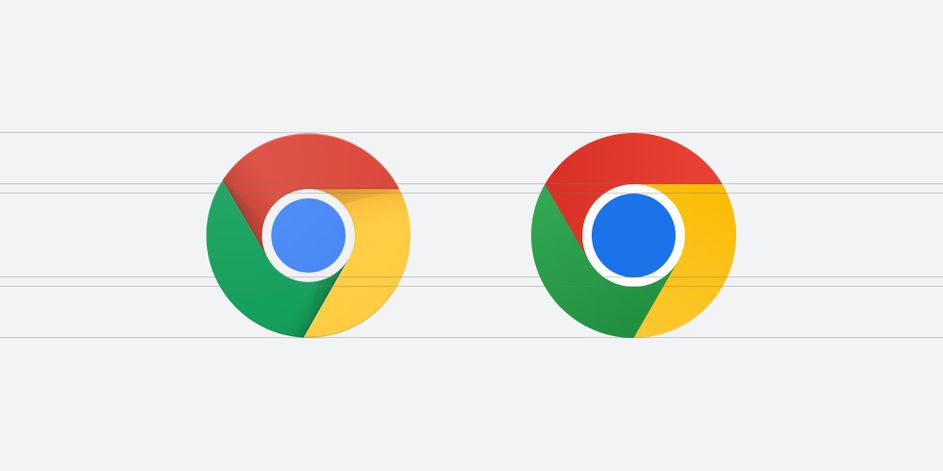
In addition to adjusting the colors, Chrome also adjusts some of the icon's proportions, making the inner blue circle significantly larger and the outer circle thinner. All of these changes are being made to "align with Google's more modern brand expression." But honestly, would you notice these changes if you didn't actually read about them now?
You could be interested in
For better integration into systems
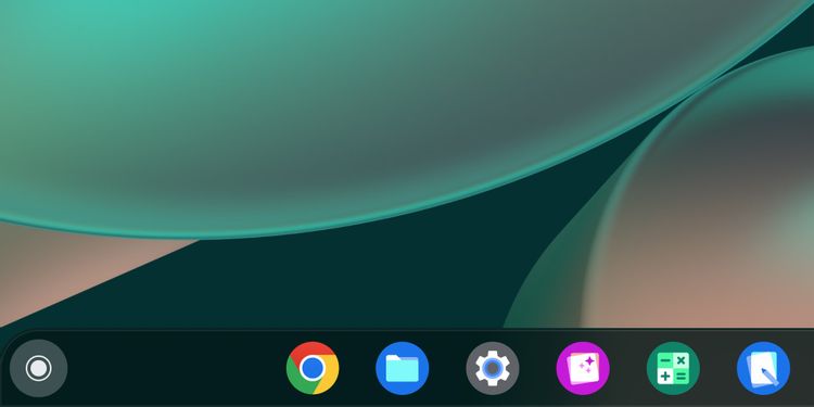
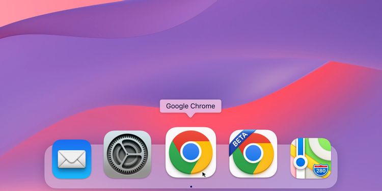
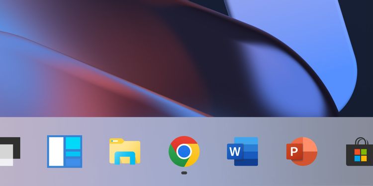
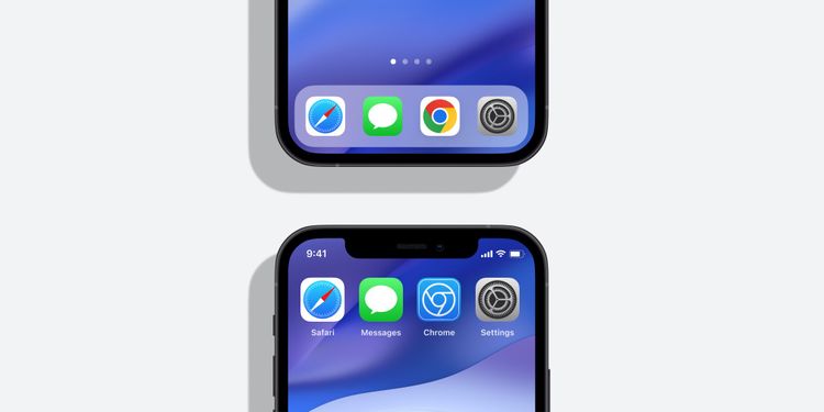
Perhaps the most significant change is how Google adapts the icon to other platforms. Chrome is now trying to blend in with the user interface design of the many operating systems available to users. For example in systems Windows 10 and 11, the icon has a clearly graduated design to better blend in with other taskbar icons, while on macOS it has a neomorphic 3D look, just like Apple's system apps. In Chrome OS, it then uses brighter colors and no additional gradients. In the case of a beta version of the application on the platform iOS then there is a small joke when the icon is displayed in a "blue" drawing style, as is the case, for example, with Apple's TestFlight title.
Chrome comes in many guises and adapts its experience to each platform it's available on, so Google saw fit to adapt its branding and icon to the platform as well. She explored a number of other and less subtle changes to Chrome's icon design, including introducing more negative space, but ultimately settled on this responsive icon. This should be expanded in individual OS versions over the next few weeks.
