In the last two years, Samsung has greatly redesigned its One UI user interface, making it one of the best system superstructures Android. He did so through gradual changes to make everything seem more cohesive and modern. It got rid of unnecessary TouchWiz elements and added new unique features. But we still miss some.
S Androidem 13 on the horizon, of course Samsung is also working on the One UI 5 update, which should be available to the general public at the end of this year. At the same time, we should expect the beta version sometime at the end of the third quarter. The current build of One UI 4.1 has all the features that Google introduced in Androidu 12, so it features Material You's own take on color selection, includes smart widgets, camera improvements including a Magic Eraser feature similar to the Pixel 6 series, and much more. But he still lacks these 5 things.
You could be interested in

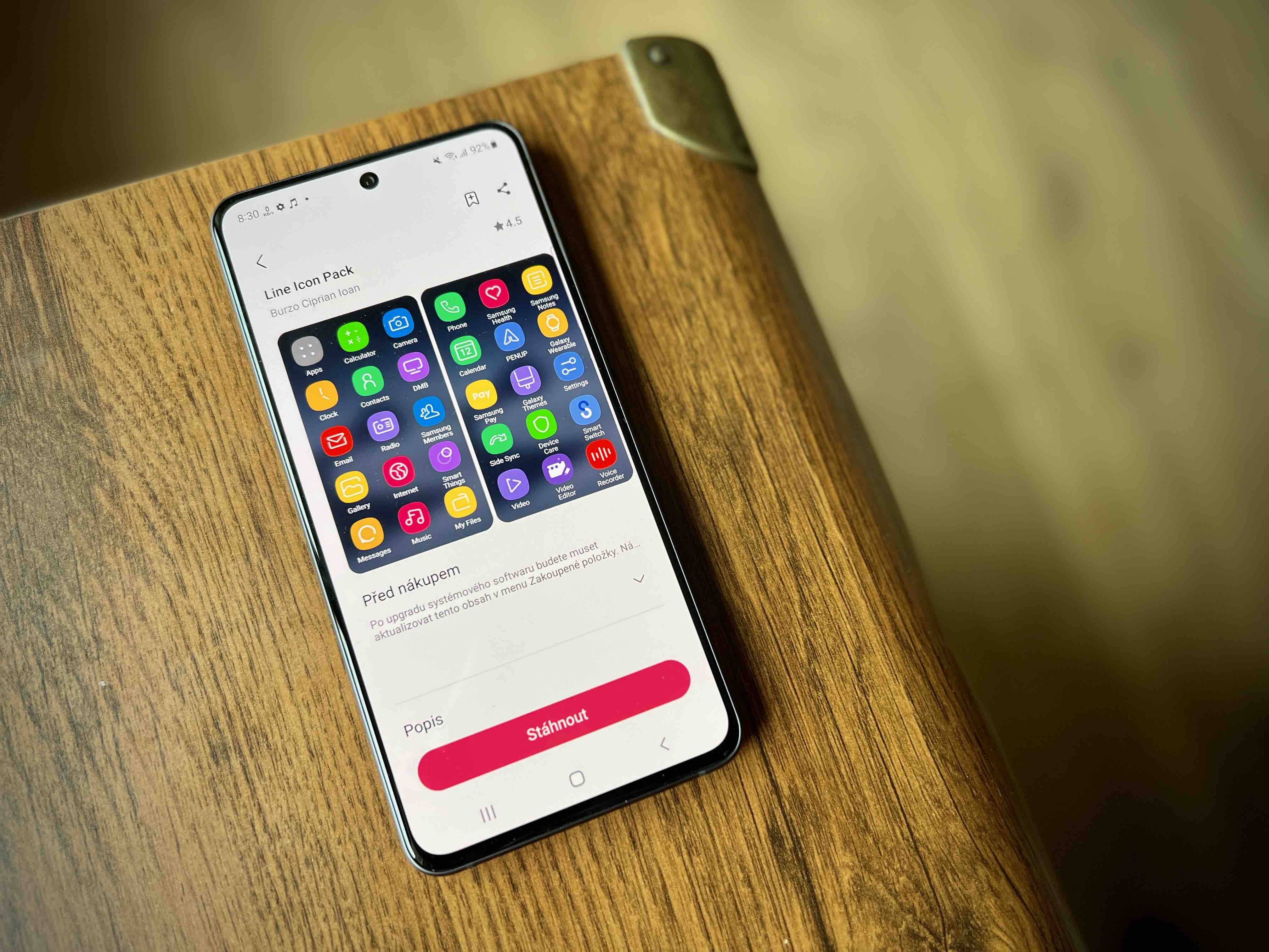
System-wide themed application icons
V Androidwe haven't seen many features yet with 13, but we do know that Google is rolling out themed app icons system-wide. Essentially, it asks developers to use solid-color icons when sending app updates, which will keep third-party developer titles themed in the same Material You palette as the rest of the interface.
This is different from how this function worked in Androidu 12. The accent colors set were limited to Google apps, making the UI look inconsistent. Fortunately, in Androidu 13 changes, and it would be great if One UI 5 took over this feature. And speaking of icons, it's incredible that Samsung still doesn't offer a way to change the shape of an app icon within the interface. Most skins from most Chinese manufacturers have had this feature as standard for some time now, and with regards to device personalization, it would be nice to see it on phones as well Galaxy.
You could be interested in
Better selection of Material You colors
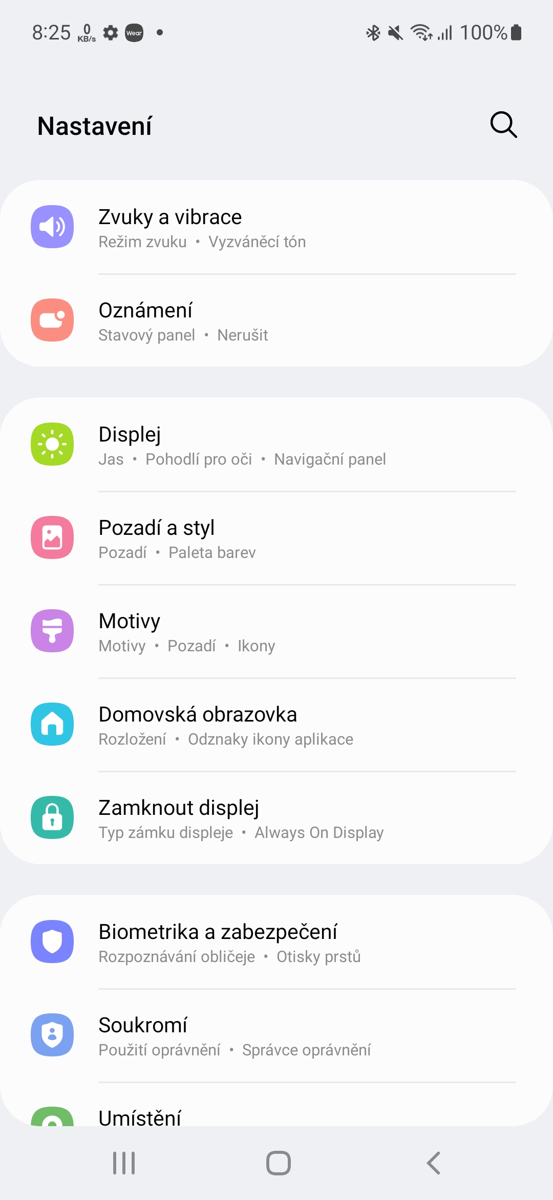
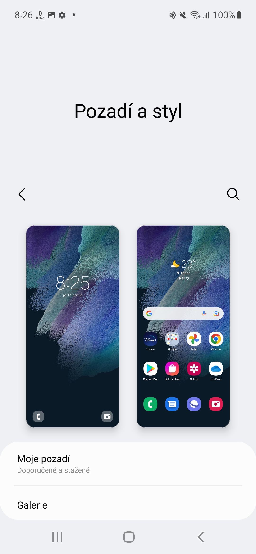
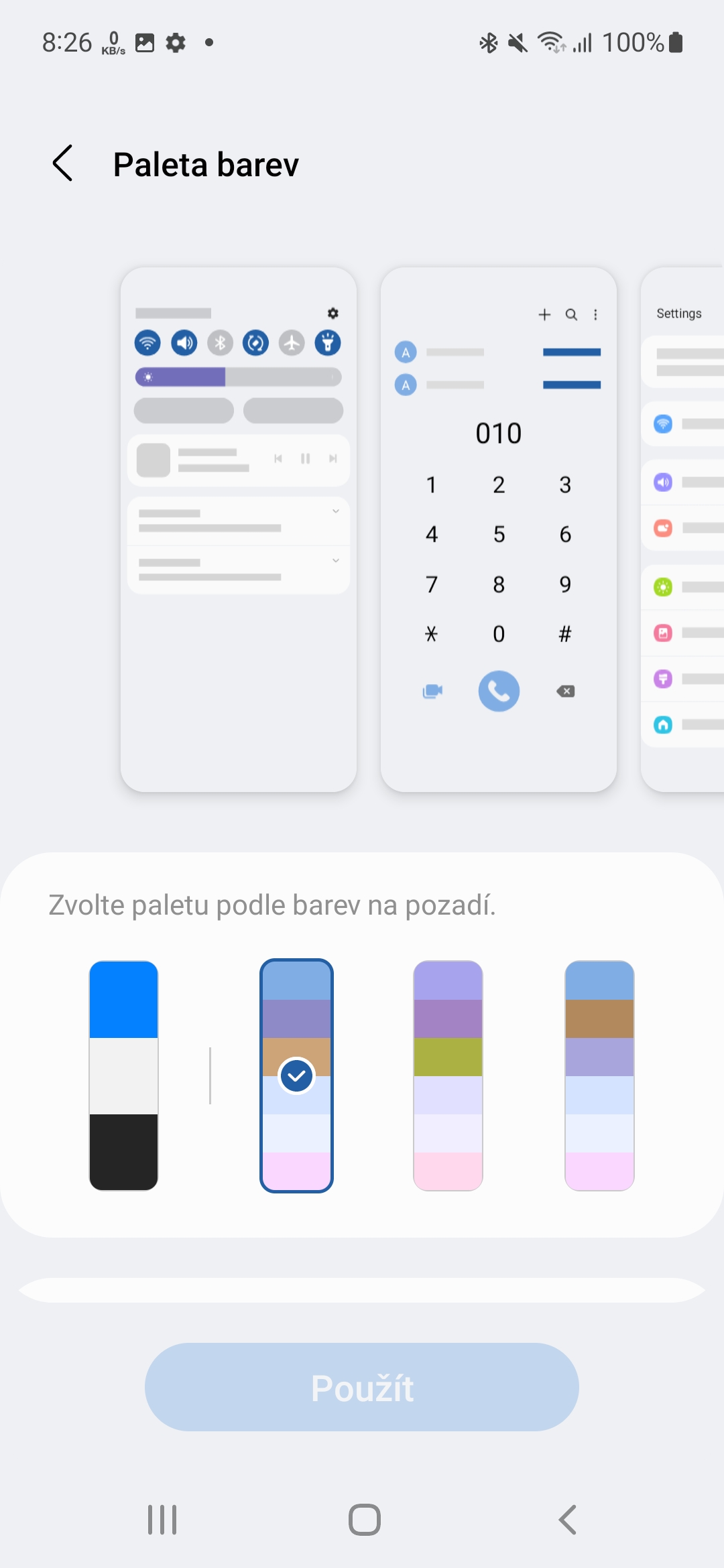
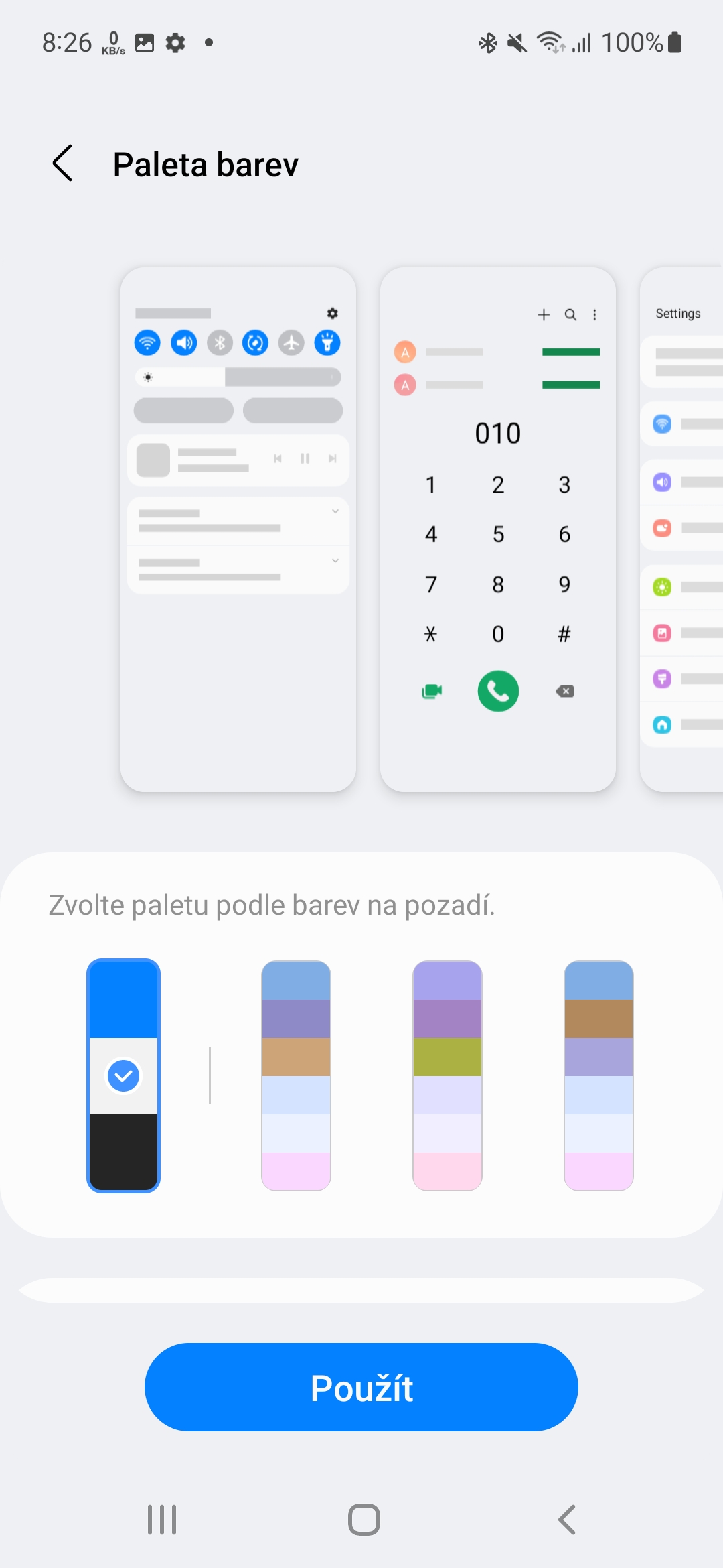
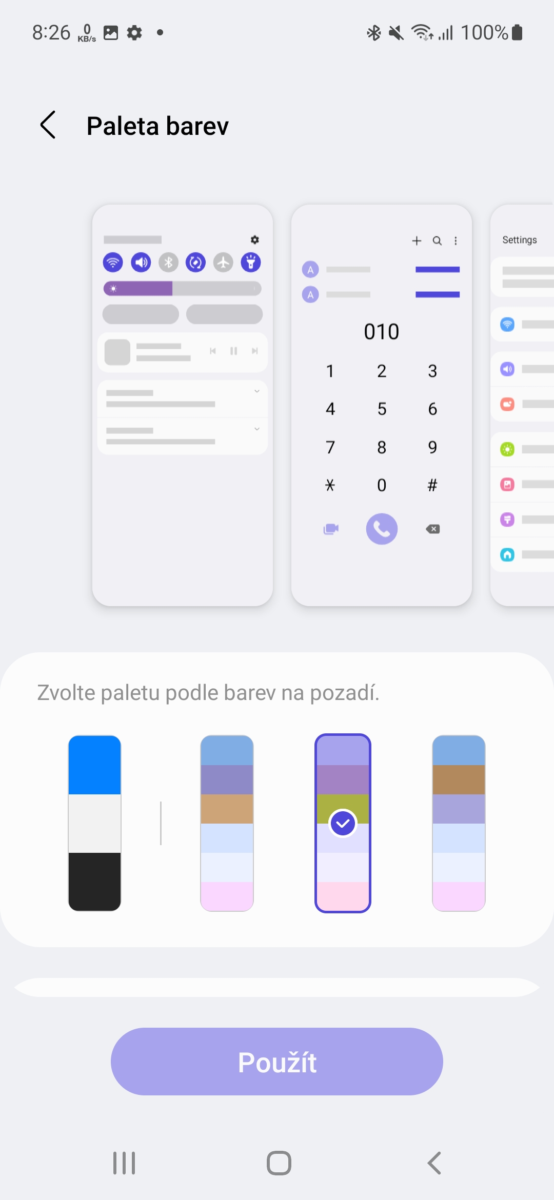
As it stands now, the Color Palette feature picks from the backgrounds you have set on your phone, so you have the ability to choose a color palette based on just those colors. One UI 4.1 allows you to choose between four to five different palettes. However, OPPO's ColorOS 12 does it a little better. It allows you to choose from the usual five color palettes that are chosen based on the background of the phone, but you also have the option to choose your own colors.
So if you don't want to use any of the offered options, you can simply set your own. This is a useful feature and OPPO has done a really good job of implementing it. However, the ability to set your own colors shouldn't be a big problem, so hopefully we'll see this option.
You could be interested in
Adjustable dark mode
Not only ColorOS, but also OxygenOS 12 or Realme UI 3.0 allow you to choose the intensity of the dark mode, with three settings available. The first is the classic dark mode with a predominating black, but medium already changes the user interface to a dark gray and the last one has an even lighter shade of gray, which is ideal if you don't like a downright dark or extra light interface.
Yes, it kind of defeats the purpose of dark mode, but having only light or dark to choose from isn't too ideal either. In addition, gray could be used all day. Of course, we understand that on OLED displays, black has added value in terms of battery saving, but we would still definitely welcome this option.
Smoother animations
One UI 4.1 has a lot going for it, but one area where it falls short of its competitors is smooth animations. They are nowhere near as smooth as they should be Galaxy S22 Ultra to be. Just put a phone next to it from the same price range and with the same specification and refresh rate of the display, and it's clear to you right away.
In a similar vein, it would be appropriate if Samsung optimized the Camera application as well. The interface itself has all the features you could want, but like some parts of the interface, it doesn't feel as smooth as competing OS phones Android. In particular, the optimization of the user interface is in line with the device Galaxy And relatively considered, even in the case of a model Galaxy A53 that has powerful hardware and even a 120Hz screen.
You could be interested in

Vertically scrolling applications in the menu
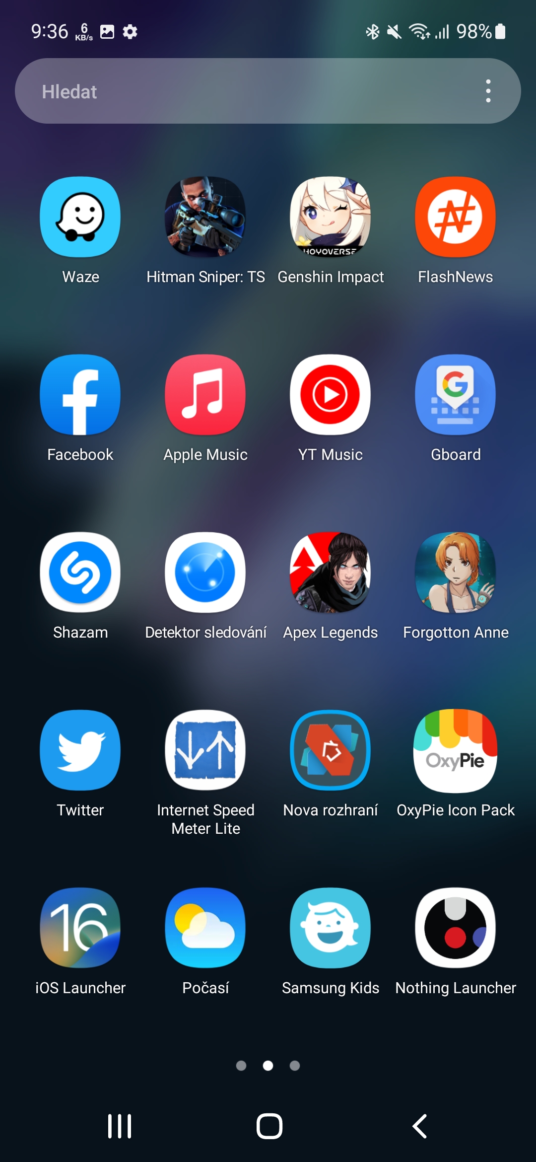
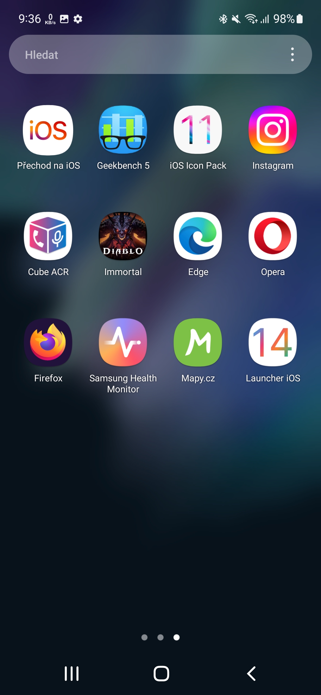
In 2022, all phones with the system have it as standard Android vertically scrolling application menu, except for Samsung. One UI 4.1 still includes horizontal scrolling of applications, and navigation between them is no longer as user-friendly as it is in the vertical case. If you have a lot of apps installed, it's simply better to find them by constantly scrolling through the title overview than trying to find the page where the title is located. There is a search, but it is not very convenient to use on devices with a larger screen.




These are such stupid "claims" that I would not dwell on them as a manufacturer. On the other hand, I would welcome it if it were possible to switch between One UI and One UI Core for all models, because it eats up the battery unnecessarily and visually there is no battery, and it would save the phone 1-2 RAM. At the same time optimize battery life. Because the latest models are poorly optimized. Even the S9+ with its 2K display used less power than the S22 Ultra. The processor runs on all 8 cores and at high speed even when doing nothing.
Yes, optimization, the most important thing of all, which probably doesn't need to be mentioned, because it's somehow counted on :-).