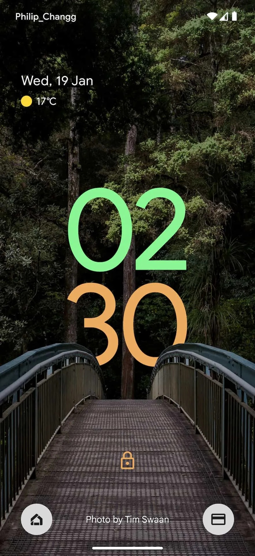
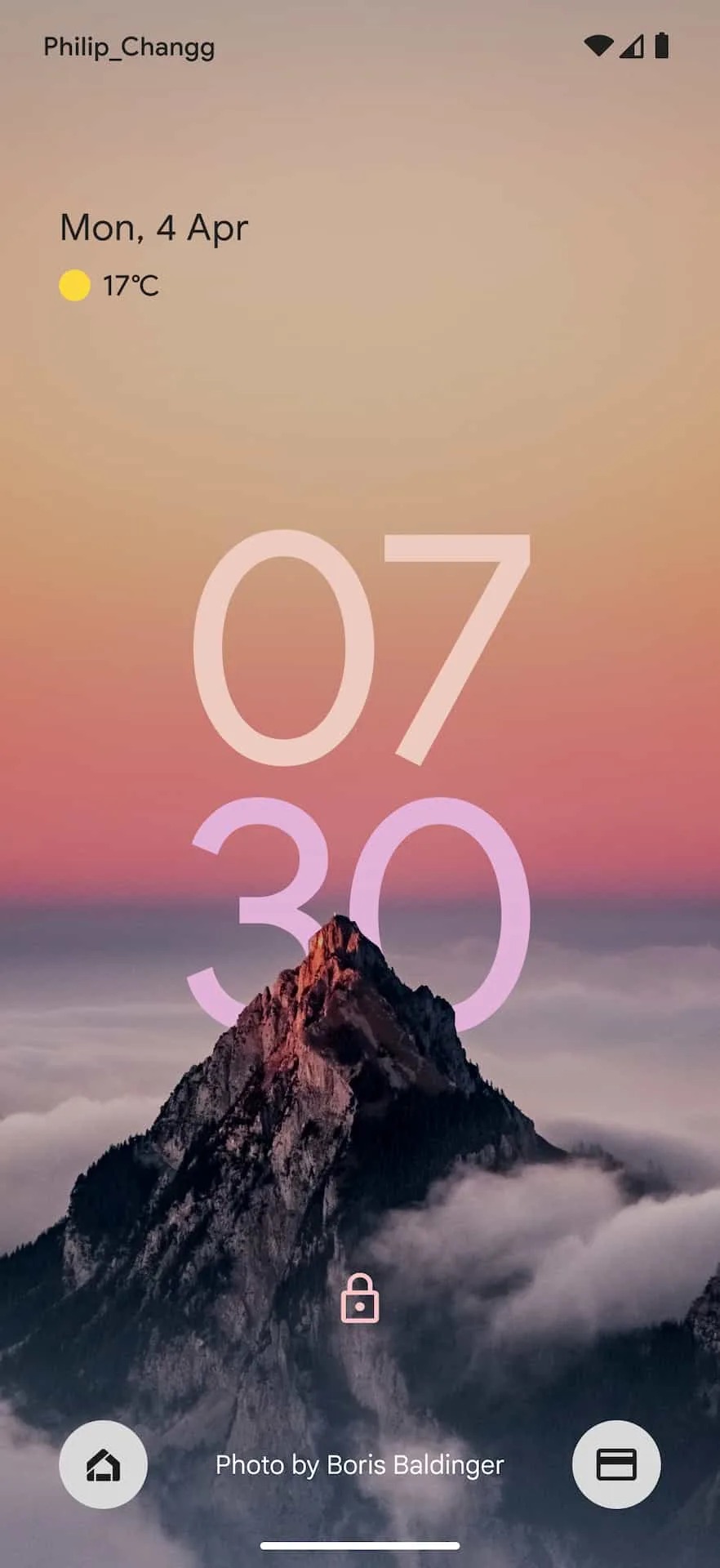
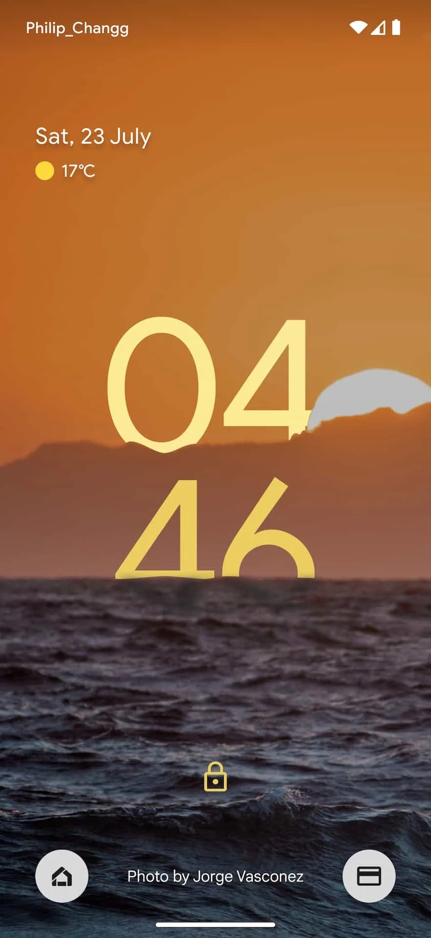
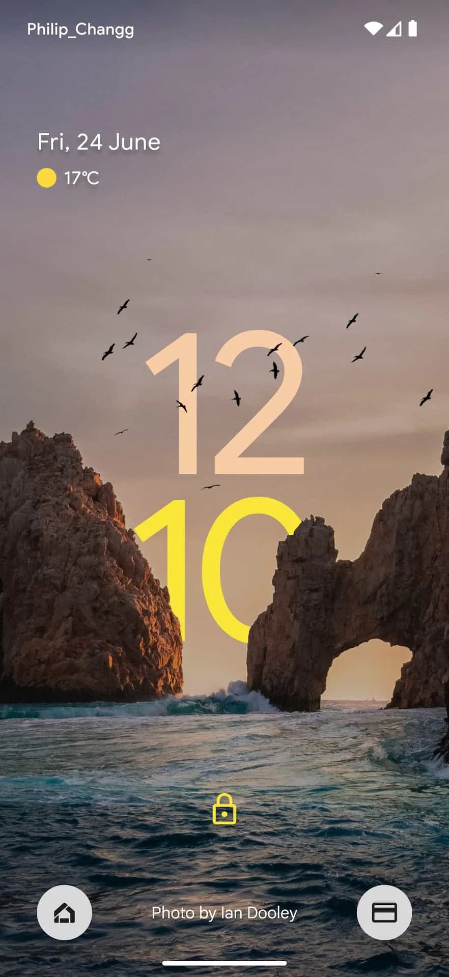
Two-line clock in Androidu 12 are one of the most striking expressions of Google's Material You design language. With regard to the use of the depth effect v iOS 16, a concept has now appeared on the air, showing how a lock screen with this effect could look on Androidu.
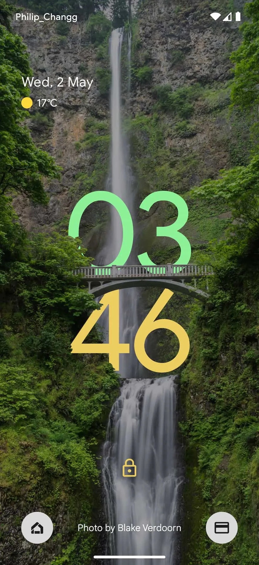
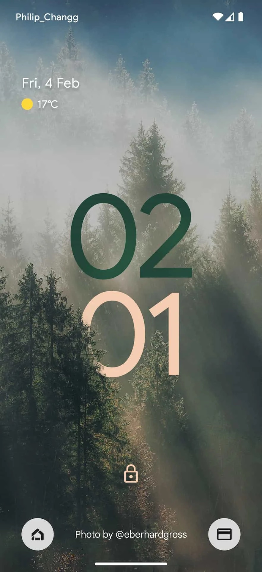
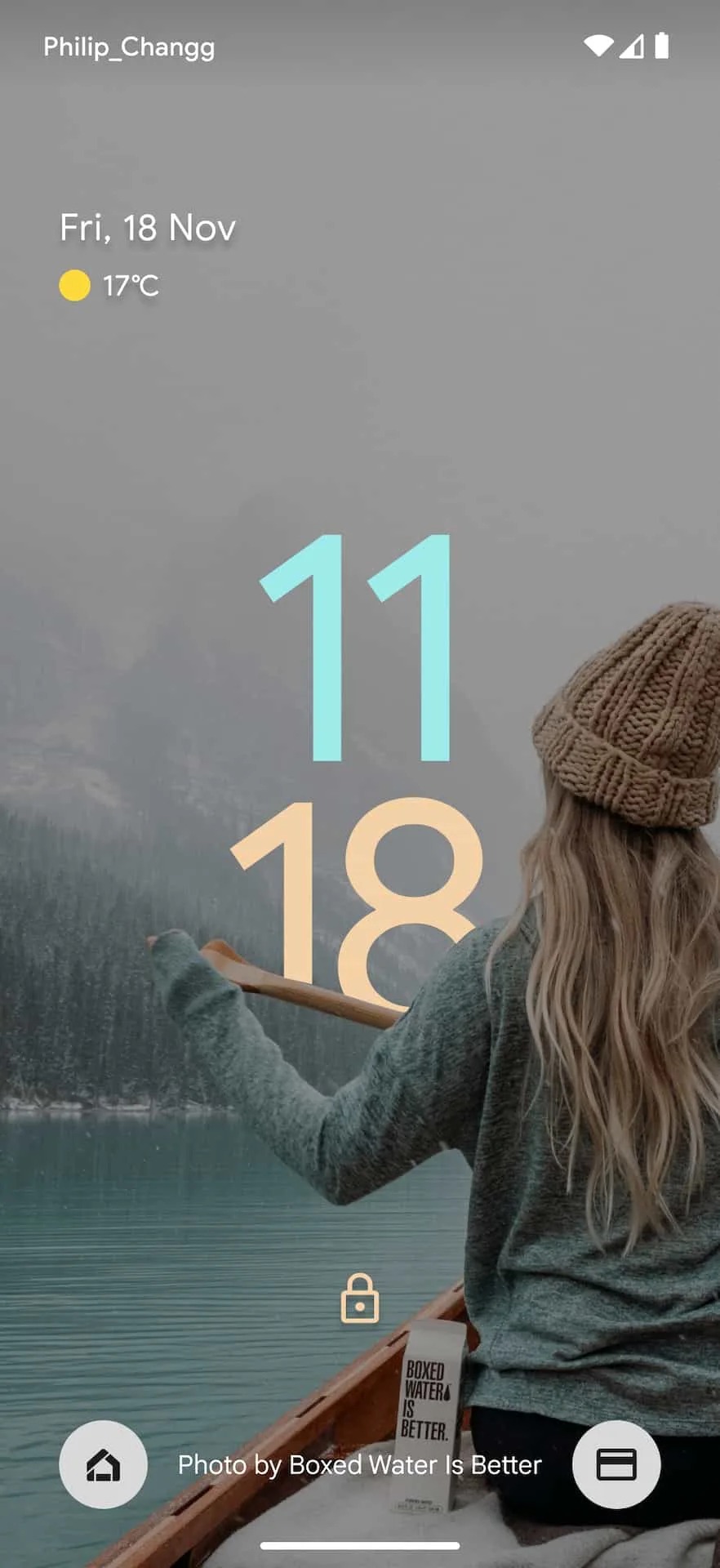
Designer Philip Chang was inspired by the system iOS 16 and created a concept that shows what the lock screen could look like in the future Androidu. The depth effect which iOS 16 brings is applied to make the clock match what is in the background image. For example, the yellow "ten" is displayed behind rock formations, and in front of the "twelve" seagulls fly above it. Also worth noting is how the hours and minutes use different colors.
You could be interested in
Other examples show time appearing on the other side of a bridge, behind a mountaintop, or against a waterfall. It must be said that the depth effect on the lock screen looks really "sexy".
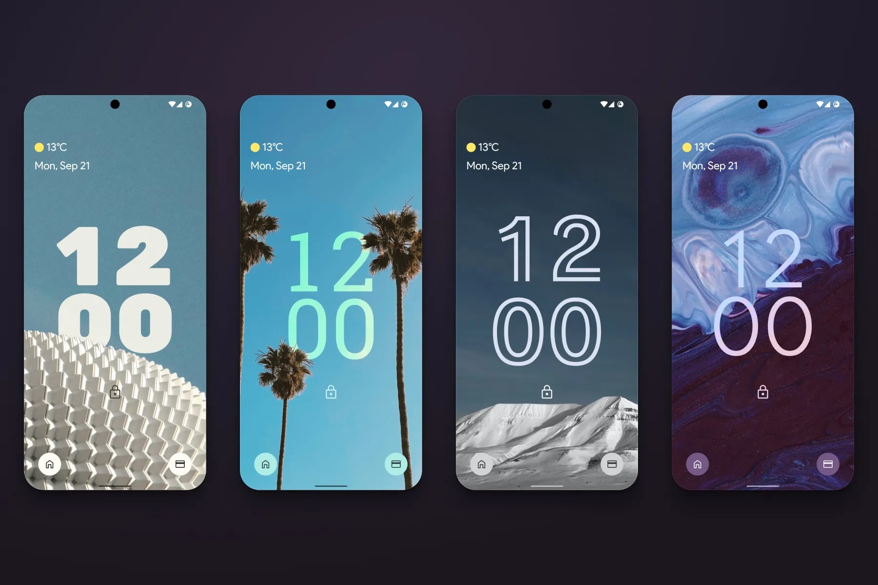
Designer Radek Bledowski meanwhile, he has created different font styles on the lock screen, with which the depth effect looks very good as well. This effect iOS 16 will certainly popularize it, but it originally appeared in the system watchOS 8 with the introduction of the Portraits watch face. Let's hope that we will see something similar on Androidu, although it will probably be next year.
