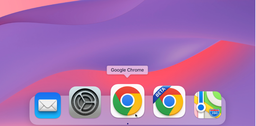
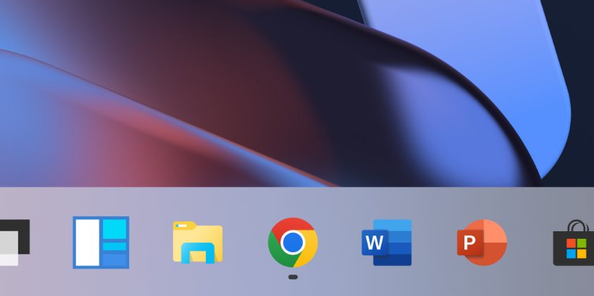
Chrome in version 100, released by Google at the end of March this year, brought a change in the design of its icon for both desktop and mobile versions after several years. The company now she was talking about how this redesign came about.
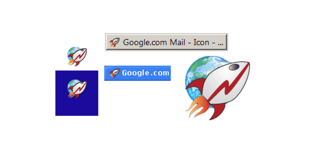
The team behind the redesign revealed that the Chrome icon was originally intended to feature a rocket flying above the Earth to symbolize the browser's speed, but eventually Google dropped that and arrived at a design that looked "accessible and clickable, and better captured its spirit." .
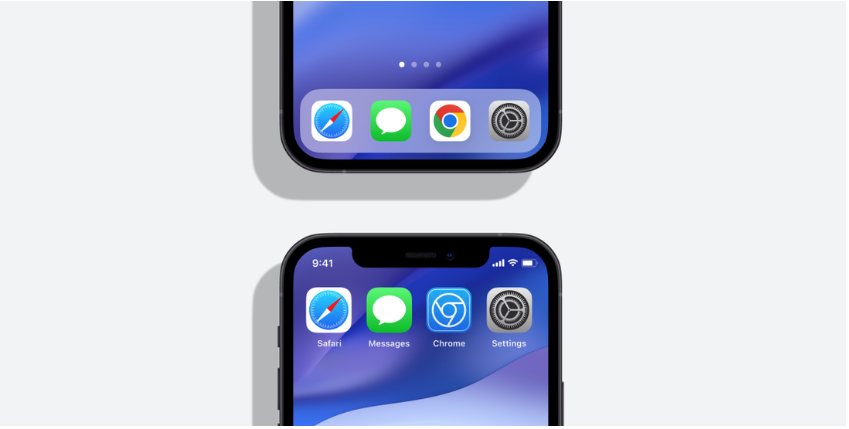
Chrome got a new logo this year because it's been eight long years since its last update and Google felt it was time for an upgrade. "We also noticed that the visual design of modern operating systems is becoming more and more stylistically different, so it was important to make the Chrome icon more responsive and fresh no matter what device you're using," said user interface designer Elvin Hu.
You could be interested in
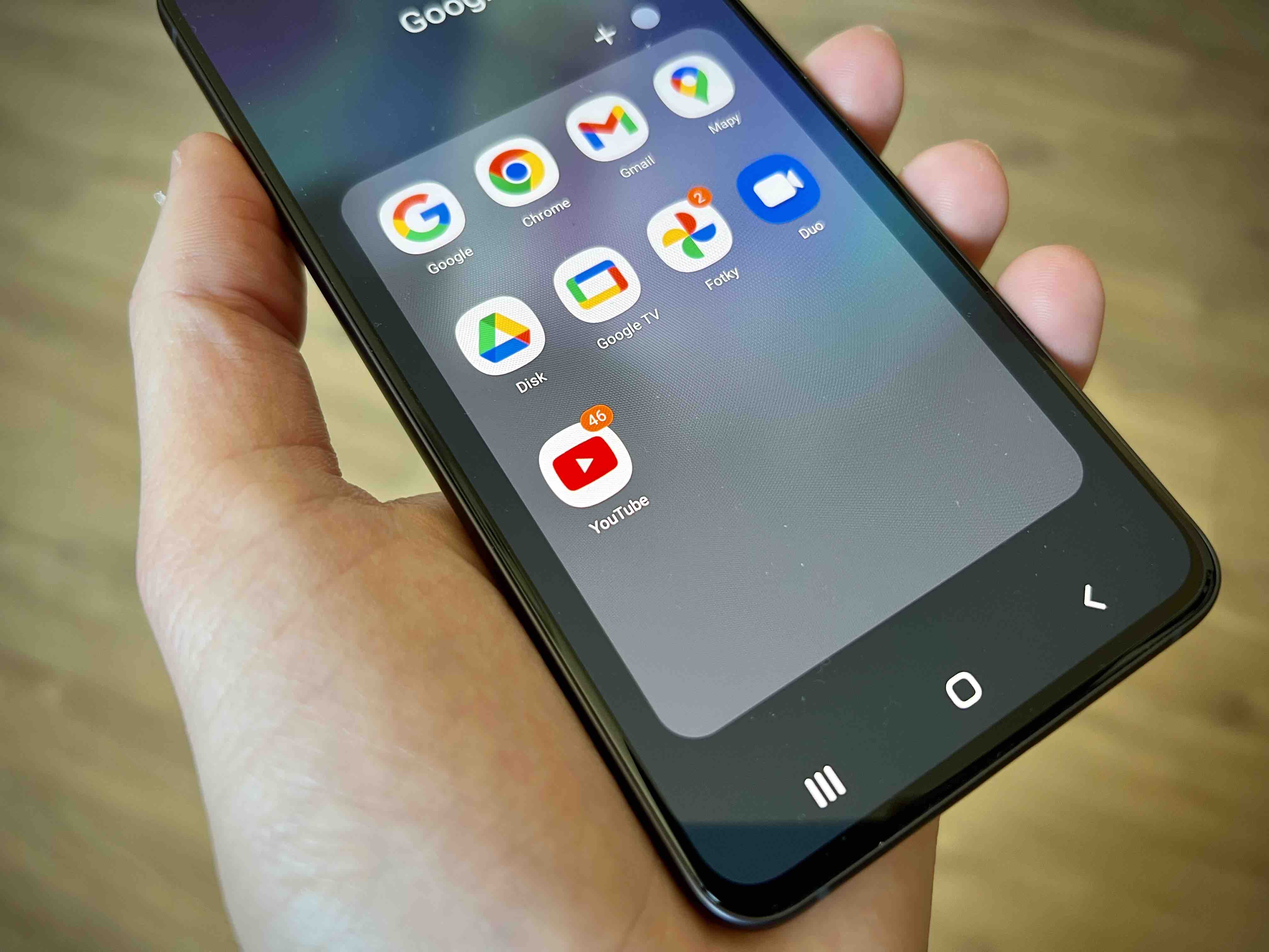
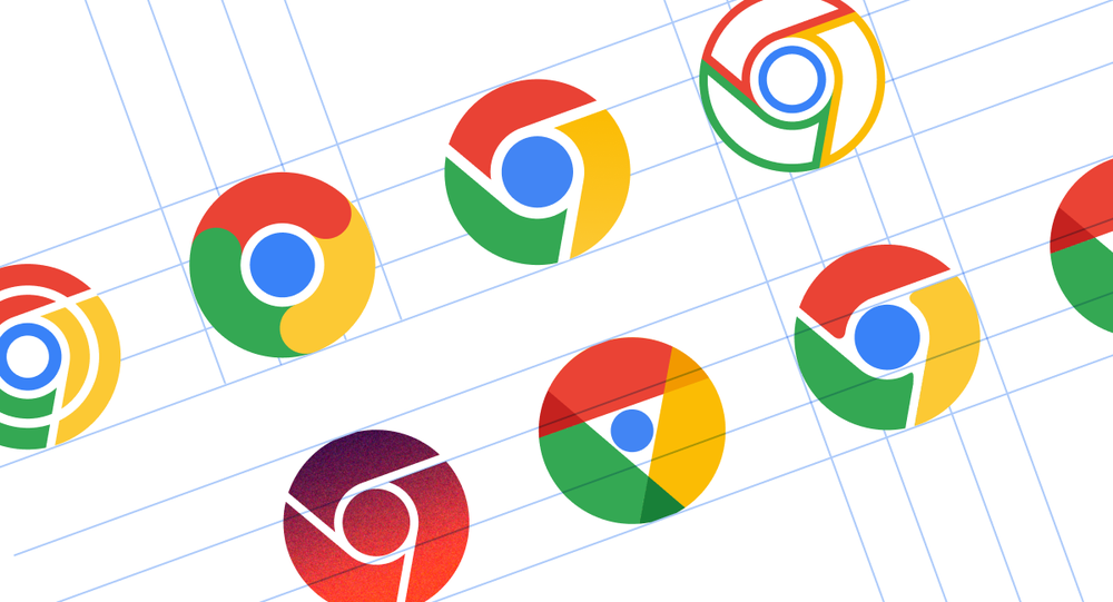
The chosen redesign of the Chrome icon is more of a refinement than something completely new, but the team "also tried options that deviated further from the overall shape we've used for the last 12 years," according to visual designer Thomas Messenger. Specifically, he said, for example, he tried to soften corners, different geometries, or decided whether or not to separate the colors with white. Looking at these designs, we can say that it is good that Google "broke off the chain" in the last update of the icon of the world's most popular browser.
